
Six Essential Design Principles for Modern Interfaces
Ever wondered what makes a “good design”? Is it the tool, or is it the designer? We may never know the answer to that, but what we do know is that there are principles that guide designers in making classic designs and we’ll be looking at six that are critical in designing modern interfaces.
1. Visual Hierarchy
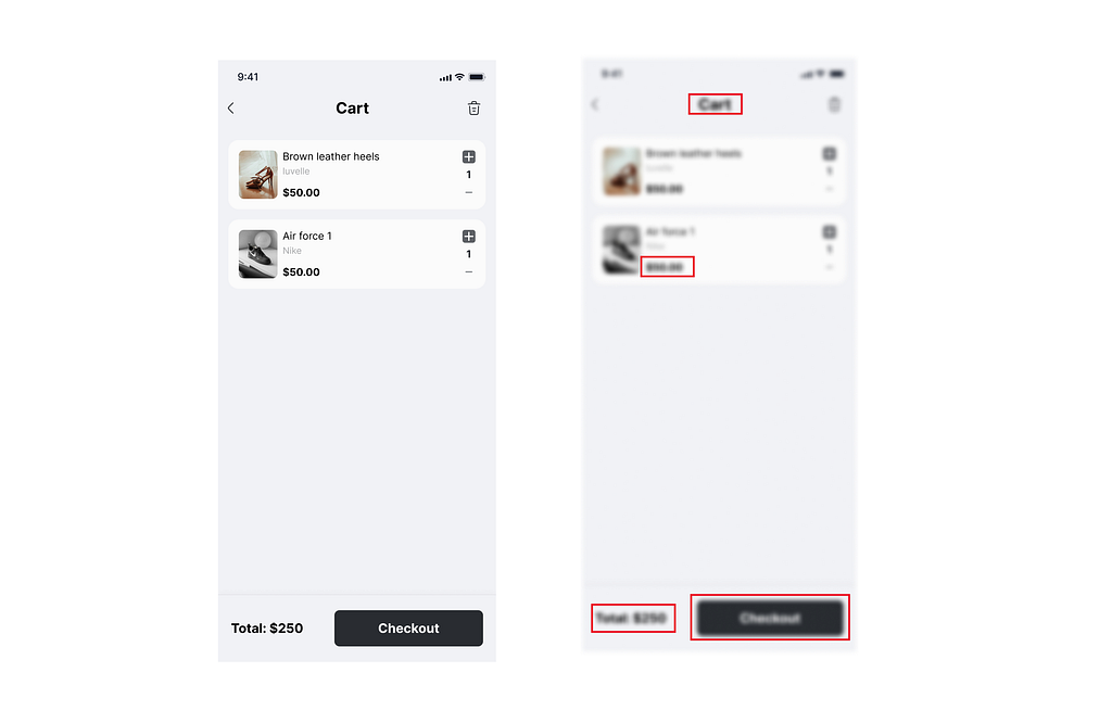
Visual hierarchy is the arrangement and organisation of design elements to guide the viewer’s attention and create a clear path for information consumption. Simply put, visual hierarchy is the principle of arranging elements to show their order of importance by guiding the eye to what’s most important and creating a logical flow.
We can use larger or bolder text to emphasize more important elements such as the price, to make it more prominent. What is most important stands out even when blurred.
Hierarchy can be displayed through typography and elements such as colour, contrast, size, alignment, layout, etc. A good visual hierarchy makes designs easier to understand and use. It helps users find what they need quickly and understand the relative importance of different elements.
Example: Think of a news website. The main headline is large and bold (size and typography). Important breaking news might be in a different colour. The layout guides you from top stories to less urgent news (placement and flow).
Visual hierarchy works because of how our brains process information. We’re naturally drawn to things that stand out, and we look for patterns and organization. By leveraging these tendencies, designers can create interfaces that feel intuitive and easy to navigate.
2. Balance
Balance in visual design relates to the distribution of weight within a composition. Or simply put, equal distribution of weight to create stability and harmony in a layout. A well-balanced layout is pleasing to the eye and ensures that no one element overpowers the design.
There are two main types:
- Symmetrical balance: Elements are evenly distributed on both sides
- Asymmetrical balance: Different elements create equilibrium through visual weight
3. Contrast
Contrast is about creating visual differences between elements. It helps important elements stand out and makes content easier to read and understand.
Ways to create contrast:
- Color (light vs. dark)
- Size (large vs. small)
- Shape (rounded vs. angular)
- Typography (bold vs. light)
4. Consistency
Consistency creates familiarity and reduces cognitive load. When elements behave predictably, users can focus on their tasks rather than learning new patterns.
This applies to:
- Visual elements (colors, fonts, spacing)
- Interaction patterns (buttons, links, navigation)
- Language and tone
5. Alignment
Alignment creates visual connections between elements. It gives designs a clean, organized appearance and helps guide the eye through the layout.
Even elements that are far apart can feel connected through proper alignment. This creates invisible lines that organize content and make layouts feel intentional rather than random.
6. Proximity
Proximity groups related elements together. Items that are close to each other are perceived as related, while those further apart are seen as separate.
This principle helps:
- Organize information logically
- Reduce visual clutter
- Create clear relationships between elements
Bringing It All Together
These six principles work together to create effective interfaces. Visual hierarchy tells users what’s important. Balance creates stability. Contrast draws attention. Consistency builds familiarity. Alignment creates order. Proximity shows relationships.
When applied thoughtfully, these principles create designs that don’t just look good — they communicate effectively and help users accomplish their goals with ease.
The best designs feel effortless to use because they leverage these principles to guide users naturally through the experience.