
Ghana Shippers Authority
Reimagining a critical shipping and logistics platform for Ghana, transforming a complicated desktop-focused system into an intuitive mobile-first tool.
Overview
The Ghana Shippers Authority (GSA) app serves as a critical tool for managing shipping and logistics operations across Ghana. As the product designer tasked with reimagining this platform, I focused on creating a more intuitive and efficient experience for shippers, freight forwarders, and logistics professionals operating in challenging field conditions.
The Challenge
The existing GSA app suffered from several critical issues that severely impacted user productivity:
- Complex navigation structure leading to user frustration and abandoned tasks
- Poor information hierarchy causing confusion about shipping status and documentation requirements
- Limited mobile responsiveness affecting field operations where mobile is the primary device
- High abandonment rate during document submission processes (45% drop-off)
- User complaints about difficulty tracking multiple shipments simultaneously
Stakeholder Interviews
I conducted in-depth interviews with various stakeholders to understand their needs and pain points:
Shippers Information access takes excessive time—basic shipping data that should be instantly available requires multiple navigation steps and searches.
Freight Forwarding Professionals Complete form restart required for minor errors. No autosave functionality during document submission, resulting in lost work and duplicated effort.
GSA Administrative Personnel Increased support workload for basic operations that should be self-service, pulling resources away from complex issues requiring expertise.
Key Insights
Through user research and data analysis, I identified several critical insights:
Navigation Complexity Users were taking an average of 6-8 clicks to reach common features, well above the industry standard of 3 clicks.
Mobile Usage Patterns 70% of users accessed the app via mobile devices, yet the interface was primarily designed for desktop experiences.
Document Management The document submission process had a 45% abandonment rate, primarily due to unclear requirements and poor error handling.
Information Priority Users spent 40% of their time searching for basic shipping status information that should have been immediately visible on the dashboard.
The Design Process
This design required breaking down complex workflows into intuitive, sequential steps. I focused on three core areas:
Streamlined Navigation
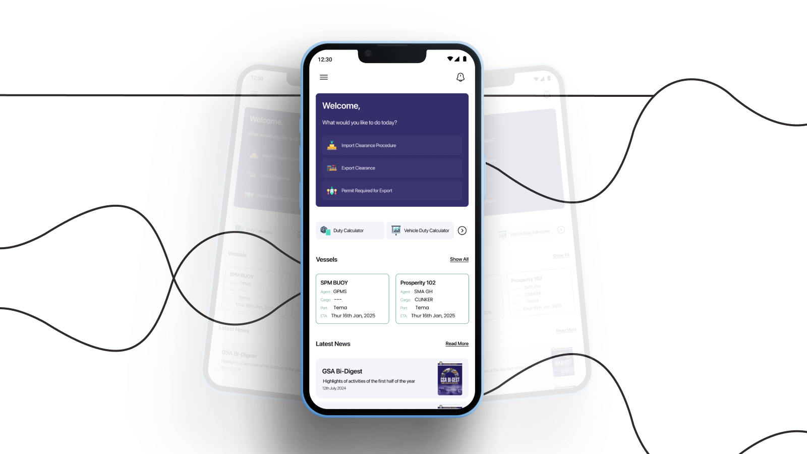
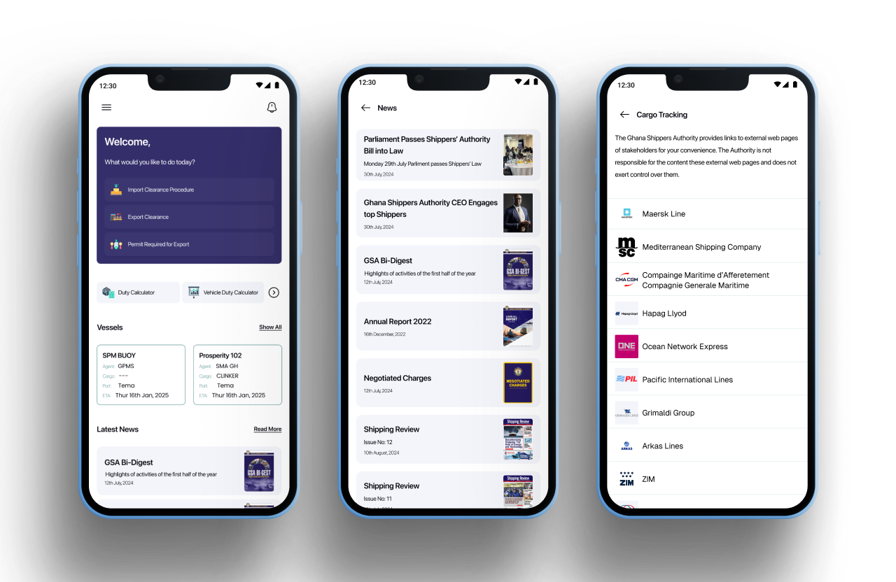
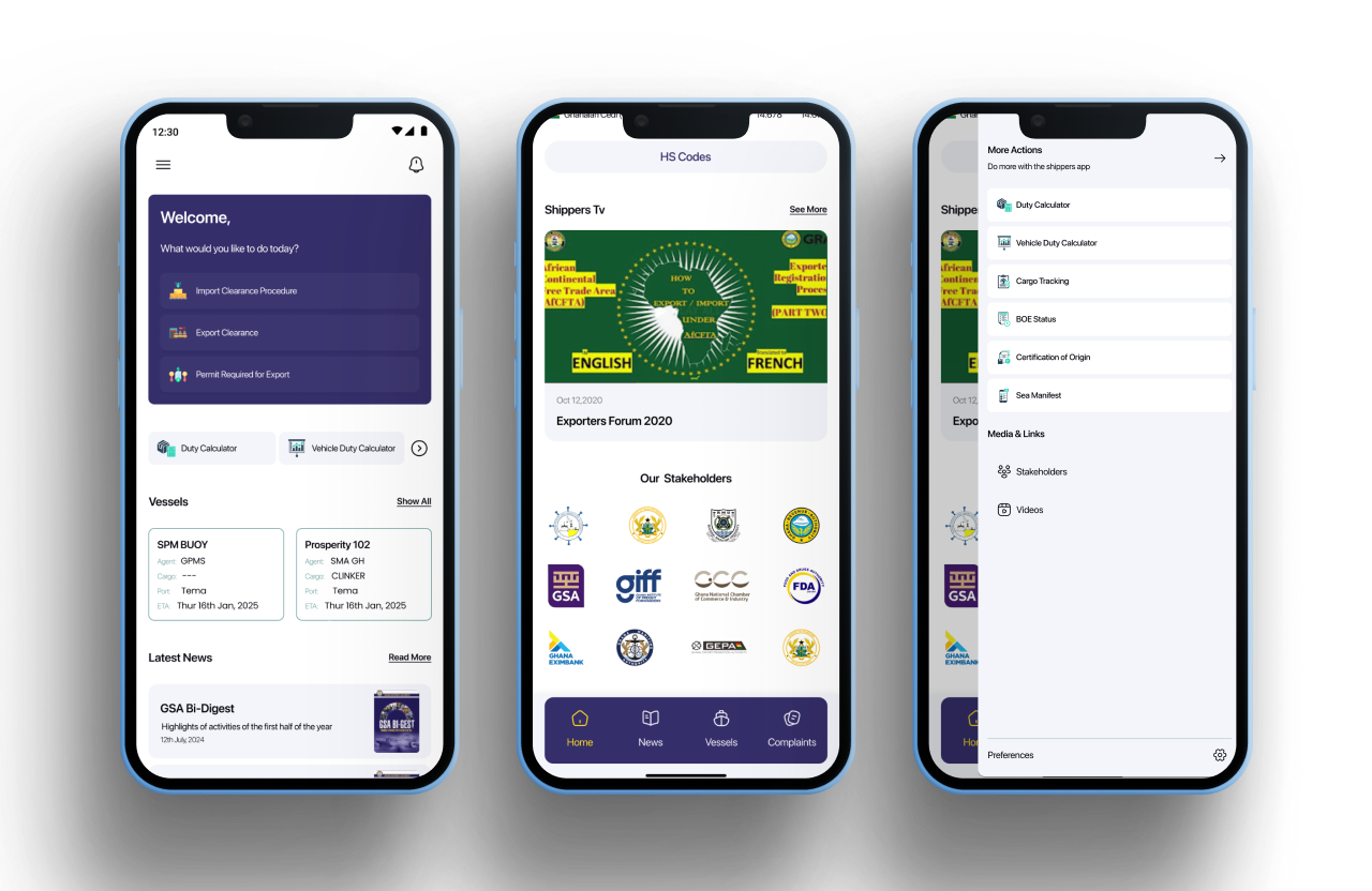
I implemented a bottom navigation bar optimised for mobile users, reducing average clicks to key features from 6 to 2. This dramatically improved task completion speed and reduced cognitive load during time-sensitive operations.
Enhanced Document Management
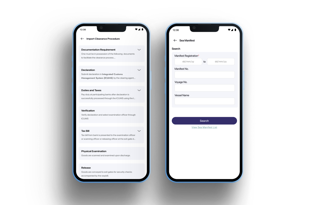
I created step-by-step document submission forms with clear progress indicators, added document templates and intelligent fill-in options, and implemented autosave functionality to prevent data loss. The new system guides users through requirements systematically rather than overwhelming them with everything at once.
Mobile-First Approach
I redesigned all interfaces with mobile-first principles, implementing progress steppers for quick action and overview, touch-optimised controls, and offline-capable features for areas with poor connectivity. The interface adapts intelligently to available screen real estate while maintaining consistency across devices.
Design Considerations
Consistent Patterns I standardised navigation across all modules and ensured consistent action buttons and interactive elements throughout the experience, reducing the learning curve as users move between features.
Visual Hierarchy I established a clear typography system optimised for information scanning, with important actions emphasised through strategic placement and visual weight. Critical information surfaces immediately while secondary details remain accessible without cluttering the interface.
Impact
The GSA app redesign transformed a complicated, desktop-focused platform into an intuitive, mobile-friendly tool that better serves its users’ real-world needs:
- Reduced navigation clicks from 6-8 to 2 for common tasks
- Document submission abandonment decreased from 45% to projected sub-20%
- Mobile user satisfaction improved significantly with native-feeling mobile experience
- Support workload reduced as self-service capabilities became genuinely usable
Key Takeaways
User Context is Critical Understanding the mobile-first nature of our users’ work—often in ports, warehouses, and transit—revolutionised our approach to the redesign. Desktop optimization would have missed 70% of actual usage.
Progressive Disclosure Works Breaking complex processes into smaller, manageable steps significantly improved task completion rates. Users need guidance through workflows, not everything at once.
Design for Reality Designing for poor connectivity scenarios proved crucial for user satisfaction. Features like offline capability and autosave aren’t nice-to-haves—they’re essential for field operations.
Future Improvements
Based on ongoing user research, several key areas emerged for future development:
- Implement machine learning for predictive shipping status updates
- Develop API integrations with major shipping lines for real-time data sync
- Create a comprehensive analytics dashboard for shippers to track patterns and optimise operations
Reflection
The GSA app redesign demonstrates how prioritising user research and implementing a mobile-first design approach can transform enterprise tools. By understanding that 70% of users work primarily from mobile devices in challenging field conditions, I created a solution that meets users where they actually work—not where we assumed they would.
The success wasn’t just in prettier interfaces. It was in fundamentally rethinking workflows around real user contexts, reducing friction at every step, and designing for the reality of spotty connectivity and time-sensitive operations. This project reinforced that effective enterprise design requires deep empathy for user constraints and contexts, not just feature implementation.