
Dodo Widget
Designing an AI-powered conversational widget that transforms fragmented website communication into a unified, brand-owned customer intelligence system.
Overview
When customers click “Chat with us on WhatsApp,” valuable conversation data leaves the company’s ecosystem entirely. Leadership loses visibility into what customers actually ask, product teams miss critical feedback loops, and brand messaging becomes inconsistent across fragmented channels.
I led the design of an embeddable AI widget that captures every customer interaction directly within the company’s domain. The widget is trained exclusively on each organisation’s data, ensuring controlled knowledge delivery while feeding real-time insights back to decision-makers.
The result: A solution now deployed across 15+ company websites, including major partners like MTN, transforming scattered customer touchpoints into a centralised intelligence system.
The Core Problem
Fragmented Communication, Lost Intelligence
Most organisations treat website chat as an afterthought, routing visitors to external platforms where conversations disappear into third-party silos. This creates three critical gaps:
- Zero visibility into customer questions and pain points
- Missed opportunities for product improvement based on real user needs
- Inconsistent messaging when responses come from personal accounts
The initial objective was clear: build an intelligent, generative AI interface that lives on the company’s website, capturing every interaction and piping it directly into the company’s data ecosystem.
MVP: Establishing the Foundation
The first phase focused on proving the concept with a robust, flexible foundation. My design contributions centred on three areas:
Technical UI Solutions for Data-Heavy Displays
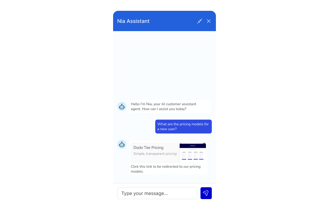
The widget needed to present complex information (product specs, pricing tables, documentation) within a compact chat interface. I designed expandable content modules and progressive disclosure patterns that kept conversations scannable while accommodating detailed responses.
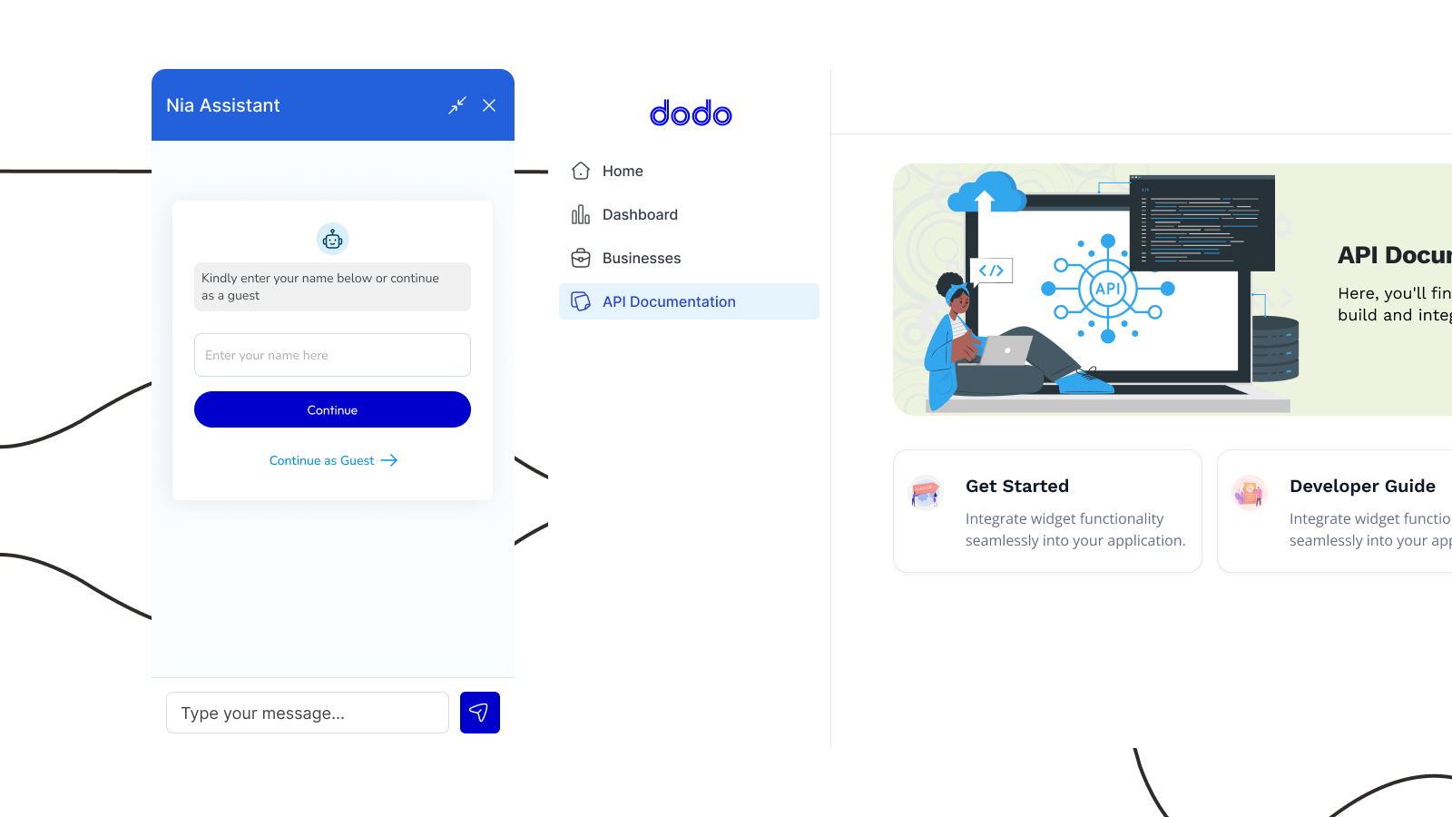
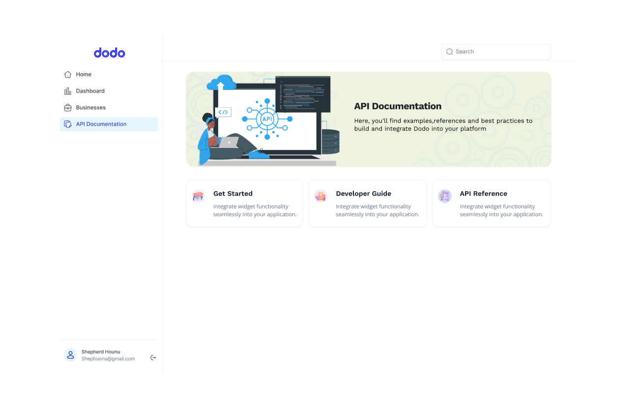
Intuitive Dashboard
We developed a robust Developer Portal. This infrastructure provides engineering teams with the tools needed for deep integration, replacing generic iframes. Through the portal, developers can manage webhooks to trigger critical actions such as KYC verifications or trade initiations, based on real-time conversation events. We further empowered teams to maintain brand consistency by offering custom CSS overrides and logic hooks that allow the widget to function as a native platform component. By prioritising this developer-centric approach, we transformed the widget into a flexible, API-first communication layer that scales alongside an organisation’s technical maturity.
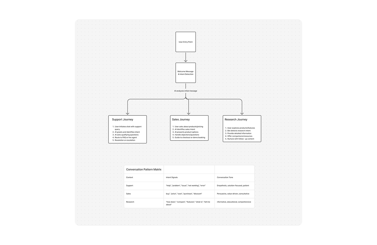
Optimised Conversation Flows
I mapped user journeys across various contexts (support queries, sales inquiries, product research) to design conversation patterns that felt natural while efficiently routing users to the right information.
Learning from Real Users
We launched the MVP with 5 partner companies to gather real-world data. The results validated our core hypothesis but revealed critical friction points.
What We Heard
Performance anxiety: Testers consistently flagged response times as “too slow” even when actual latency was acceptable. The issue was perceived performance, not actual speed.
Trust barriers: Companies expressed mixed feelings about uploading organisational data. Security concerns weren’t just technical, they were psychological. Partners needed visible reassurance, not just backend encryption.
Key Insights
These findings shaped two clear priorities for version 2:
- Refine perceived performance through interface optimisations that make the experience feel faster
- Build visible trust through transparent data handling and clear value communication
The MVP’s success (onboarding MTN and Melcome as major partners) validated the core concept. But scaling required addressing these friction points directly.
Version 2: Designing for Scale
V2 development responded directly to MVP learnings. My role expanded to translating research insights into product requirements and design solutions that would support partner growth.
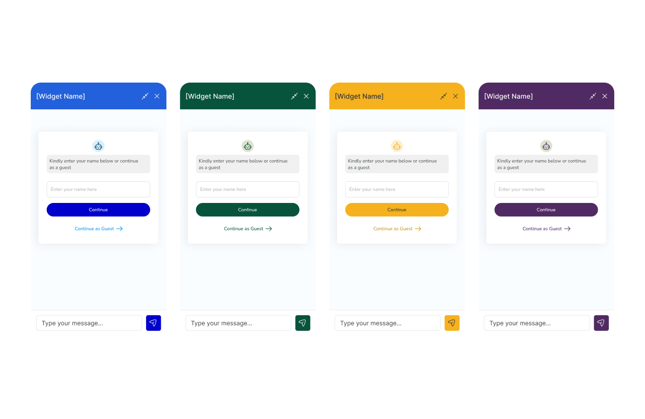
Seamless White-Labeling
MVP testing revealed that users felt jarred by what felt like “suddenly using a new platform.” V2 introduced deep customisation that lets partners fully own the visual experience:
- Brand colour systems that apply intelligently across all UI states
- Custom iconography and avatar options
- Configurable welcome flows that match partner voice and tone
- Seamless visual integration that feels native to each website
This eliminated the cognitive friction of context-switching and increased user trust through brand familiarity.
The Vault: Visible Data Security
We rebuilt the data architecture around a “vault” metaphor, both technically and in how we communicate it:
Strict encapsulation: Each organisation’s data remains completely isolated. Information from Company A never influences responses for Company B.
The librarian model: We positioned the AI as a librarian with access only to that specific company’s “private library.” This framing made abstract security concepts tangible and trustworthy.
Visual trust indicators: I designed interface elements that reinforce security, subtle but visible reminders that conversations are protected and data-handling is transparent.
Perceived Performance Optimisation
Rather than just improving actual speed, I focused on making the experience feel instantaneous:
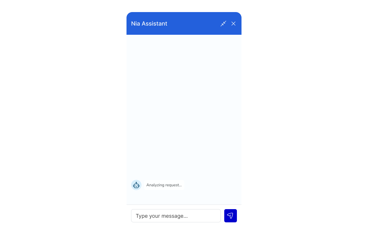
Adaptive loading states: Skeleton UI components that preview content structure before data arrives, making wait times feel purposeful rather than empty.
Progressive response delivery: Working with engineering on prompt optimisation, we prioritised concise initial answers followed by detailed information. Users in low-bandwidth regions received critical guidance immediately.
Conversation momentum: Micro-interactions and typing indicators that maintain conversational rhythm even during processing.
Design System Considerations
Building for 15+ partner deployments required systematic thinking about flexibility. I established:
- Theming tokens that partners can override without breaking functionality
- Responsive behaviours that adapt to varying embed contexts (sidebars, full-page, mobile)
- Accessibility patterns ensuring the widget works for all users across partner sites
Impact
Version 2 positioned the widget for significant growth:
- Partner acquisition: Advanced white-labeling reduced integration friction, accelerating new partnerships
- Reduced drop-offs: Performance and trust improvements directly addressed MVP abandonment causes
- Revenue growth: Higher adoption and engagement across partner sites
The widget evolved from a chat interface into a strategic product, one that transforms how organisations capture, understand, and act on customer intelligence.
Reflection
This project reinforced a core design principle: perception shapes experience as much as functionality. Users didn’t need faster responses, they needed responses that felt faster. Partners didn’t need more security, they needed security they could see and understand.
The shift from MVP to V2 wasn’t about adding features. It was about deeply understanding why the MVP’s success had limits, then designing solutions that addressed root causes rather than surface symptoms.